Krishna Doshi
Work
About
Play
Status
Practicing magic

A 0-to-1 fintech product built with an AI coding agent. Hours of advisor work, down to 3 minutes.
Client
Scatterplot
Year
2025
Status
Live
Website
Skills
Product design
AI Builder
UX research
Website design
Branding
My Role
Led end-to-end product design across discovery, IA, and visual system for a 0-to-1 financial product
Designed both user-facing surfaces: the advisor-facing app and the internal admin/content-governance panel, as one coherent system
Owned the information architecture through two major structural rejections and rebuilds
Directed an AI coding agent (v0) to build production UI from Figma-defined direction, then partnered with engineering to evolve the design system as the build matured
"How do we let advisors build a fully branded, always-current client deck in minutes, without ever letting them touch the content itself?"
About the project
Financial advisors were rebuilding client decks by hand, every time the market moved, and the data was stale before the deck was even finished. The brief: a tool that hands advisors expert-built, daily-fresh charts, lets them brand it as their own, and gives them no way to introduce a compliance risk while doing it.
Discovery: What the problem actually was
The market already had tools that solved half of this. None solved both halves at once.
Branding
Template libraries let advisors brand their slides, but the data inside went stale in weeks
Freshness
Research-firm decks stayed current but couldn't be branded as the advisor's own
This Leads to
The actual design thesis for the product: the differentiator wasn't the charts themselves, it was the combination: content, daily-refreshed, fully white-labeled, at a price point a single advisor could justify. Every IA and interaction decision that followed was tested against that combination, not against "is this a nice chart."
A second, harder constraint shaped the whole system from day one: the product could never give the advisor a way to edit chart content, only its skin. Compliance risk had to be designed out of the interface, not policed after the fact.
Scale, and how we got there
240,000–370,000 financial advisors in the US alone do this kind of work with no in-house design or research team to lean on.
First rejection: Workspace layout
Before any build work started, the core workspace IA went through its own rejection at the wireframe stage.
The original proposal opened a deck as a side panel, with slide previews stacking on top of the library underneath it.


High fidelity v0 wireframe layouts
Why this got rejected
Browsing the library and previewing a slide couldn't happen at the same time, and building a deck meant constantly losing sight of one or the other. Adding a single slide went from 2 steps to 5.
"If an advisor can't see the deck and the library at once, they're going to give up halfway through building it."
The fix was structural, not cosmetic
A three-panel workspace with slides list on the left, preview in the center, and deck-in-progress on the right, so all three states stay visible simultaneously.
This decision became the backbone of the entire retail product. The same three-zone logic reappears in the admin panel's slide-management view, for the same reason: an admin reviewing or disabling a slide needs the same simultaneous context an advisor needs while building.

3 panel structure of slides, preview and deck being made.
A stakeholder disagreement worth naming
Ask
Deck-creation should be the first thing advisors see on login.
Our Case
Usage wasn't just creation. Advisors also needed to browse, edit, and revisit old decks, and a creation-first home page would bury all of that.
Conclusion
The call went the other way. The home page opens straight into deck creation today, exactly as asked.
Ask
Remove the grid view from the slide library entirely, leaving only a left-panel list with a right-side preview view
Our Case
Browsing through a lot at once, revisiting old slides, and checking what was recently made all benefit from a scannable grid.
Conclusion
The call went the other way again. List-and-preview shipped as the only view.
The slide system itself
One fixed anatomy: title, description, chart area, legend, disclosure, source, firm logo, shared by both content types the library supports: charts and data tables. The same skeleton holds a sector-breakdown table and a performance line chart, so they read as one product, not two.
Grounded in IBCS
(the international standard for business-data visualization): things that mean the same thing have to look the same, every time, regardless of brand.
A4-proportioned canvas, built for print/export, not scroll
Chart/table held to 53% of the slide; the rest reserved for description, disclosure, and logo
No scrolling: bigger datasets get a bigger chart or denser table instead
Interactive while browsing the library; locks static once placed on a slide for export
One-color chart system: every series is a tint/shade of the advisor's single brand color, so line and flow charts still read clearly without breaking white-labeling
IBCS-aligned fixed positions for every recurring element: auto-contrast on light brand colors, auto-pagination on long disclosures, auto-expand on missing descriptions, 13-row table cap, default branding fallback, so the same element behaves the same way on every slide, regardless of content

Designing the governance layer
The advisor-facing product is only half the system. The other half, the admin panel, is the backend for the whole retail product: managing the slide library, adding and creating new slides, controlling disclosures, wiring up the data APIs behind every chart, and surfacing what content is actually getting used versus sitting untouched.
The one flow that had no precedent to build from
Adding a new slide to the library. There was no existing pattern to lean on, so we gave it a fixed, template-like structure with the same input fields, in the same order, every time a new slide gets created, so the process stayed consistent no matter who on the team was adding content.

Admin panel with metrics, working slide edit and creation flow (the desktop screen is in the color scheme of previous branding)
Building it: Where the process got hard
Budget and timeline ruled out a fully-speced, page-by-page Figma handoff before development started. The team made a deliberate bet: define visual direction in Figma, then hand that direction to an AI coding agent to build the actual key screens, interactions, and flows, a workflow almost nobody outside engineering teams was running yet, in early 2024.
Four symptoms, surfacing at once, not in a clean sequence.
Filter/Drift
Screens grew visually inconsistent the longer a single flow went on
Crashes
The app broke outright in early sessions, more than once
No Memory
Every new prompt risked quietly contradicting a screen already made
IA Misreads
Whole categories of pages got grouped wrong, repeatedly
The clearest evidence: two near-identical design-token files, generated days apart for the same product, defining two different color systems, neither matching the brand.
"We built this exact screen yesterday. Why does it look different today?"
Midway through, branding landed on top of all of this: a visual identity the in-progress system had no way to absorb cleanly yet.

The pages were made as inline code for another pages and video for the broken layout of header and scroll


Two different css files for styling. Broken charts loading up.
The recovery was a documentation decision, not a retreat from the tool
We kept building many retail flows and screens directly through the coding agent, but started documenting every shipped flow in Figma as the system of record alongside it, so the design intent was never only living inside the agent's own memory.
The admin panel went further: it was built almost entirely through the coding agent, end to end, and it was the fastest delivery of the whole project. Devs only had to reiterate the generated code, not rebuild it.
I was one of the first people in the company to experiment with an AI coding agent in a live client project.
A direct result of this challenge
The code literacy I built to navigate it didn't stay project-specific. I led a company-wide training session afterward on how designers and AI coding agents should actually work together: prompting discipline, when to trust the output, how to find your own way into building a design system with the agent's help, and where to keep pushing it for genuine innovation rather than safe defaults.
Measuring the outcome
Budget and timeline ruled out a fully-speced, page-by-page Figma handoff before development started. The team made a deliberate bet: define visual direction in Figma, then hand that direction to an AI coding agent to build the actual key screens, interactions, and flows, a workflow almost nobody outside engineering teams was running yet, in early 2024.

One honest finding
Usage skews nearly 2:1 toward onboarding-style content over the daily-market-update slides the product was originally designed around. Not a failure, a signal now shaping the roadmap.
Reflection
The hardest design problems in this project weren't about charts or layouts. They were about deciding, repeatedly, what the system should never let the user do. Locking content while still making the product feel flexible, making a compliance rule invisible instead of punitive, designing a governance layer that explains itself instead of failing silently: that's the actual shape of the work.
The tooling story is real, but it's a chapter inside this, not the headline. The headline is a 0-to-1 financial product that had to be trustworthy, fast, and brand-flexible all at once, and a design process that got tested by real constraints at every single stage, from the first rejected wireframe to the last governance rule.
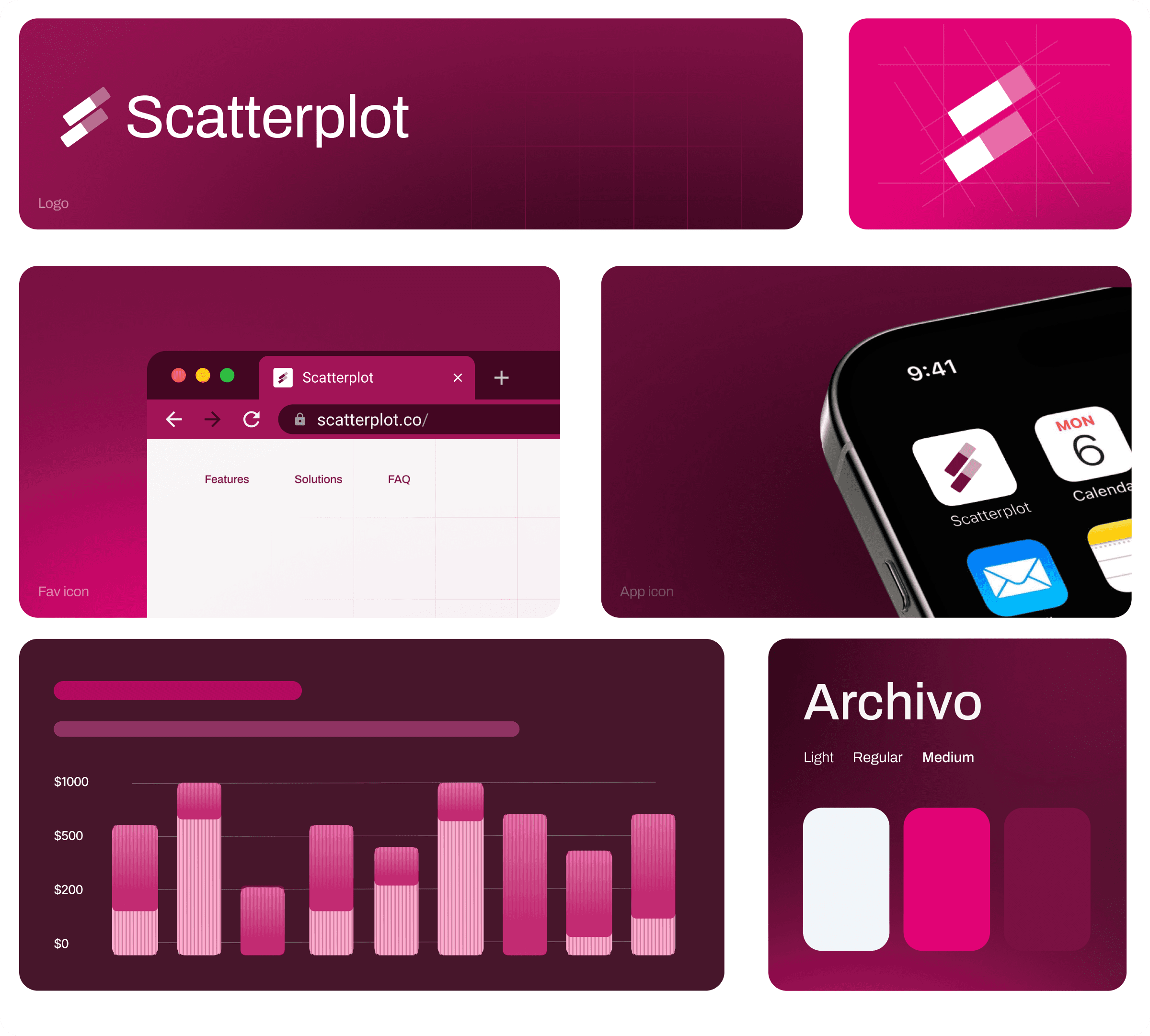
worked on the retail responsive product, responsive admin product, branding and the website


Mobile responsive screens for the retail product, similarly worked on the admin responsive flow as well
Other Projects.
Lorem Ipsum is simply dummy text of the printing and typesetting industry. Lorem Ipsum has been the.




Lorem Ipsum Lorem Ipsum Lorem Ipsum Lorem Ipsum Lorem ;)

PREV
NEXT





Lorem Ipsum lorem ipsum
Page
Work
Play
About
Say Hi!
Resume
Krishna Doshi